The visual generation of the Ruco brand has focused on creating an attractive and coherent brand identity that connects with its target audience: consumers interested in buying pajamas. The brand has opted for a modern and minimalist visual style, using a soft and relaxing color palette.
The Ruco logo has been designed with a clean and modern typeface, using a pale pink and black tone to represent elegance and sophistication. This style has been maintained throughout the brand's identity, including product labels and images used on its website and social media.
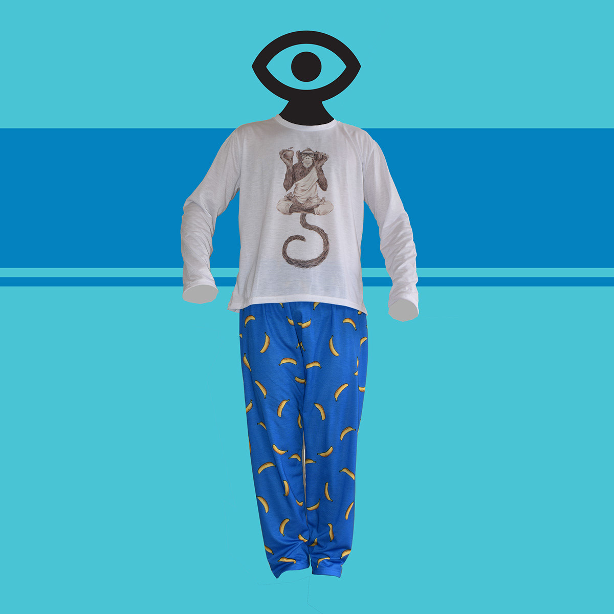
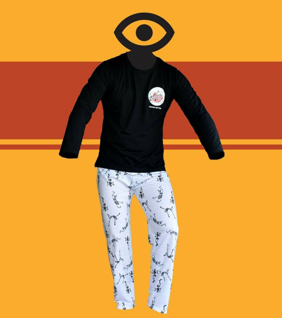
Ruco's visual marketing strategy has focused on creating engaging and relevant content for its customers, using images and videos that showcase the comfort and quality of their pajamas. The photographs include models that show products in use in everyday situations, helping customers visualize how they would feel wearing the garments.
In addition, the brand has incorporated unique visual elements, such as the use of custom illustrations to represent each pajama model, which helps differentiate products and attract customers.


!THANKS FOR VISITING!
Contact me


